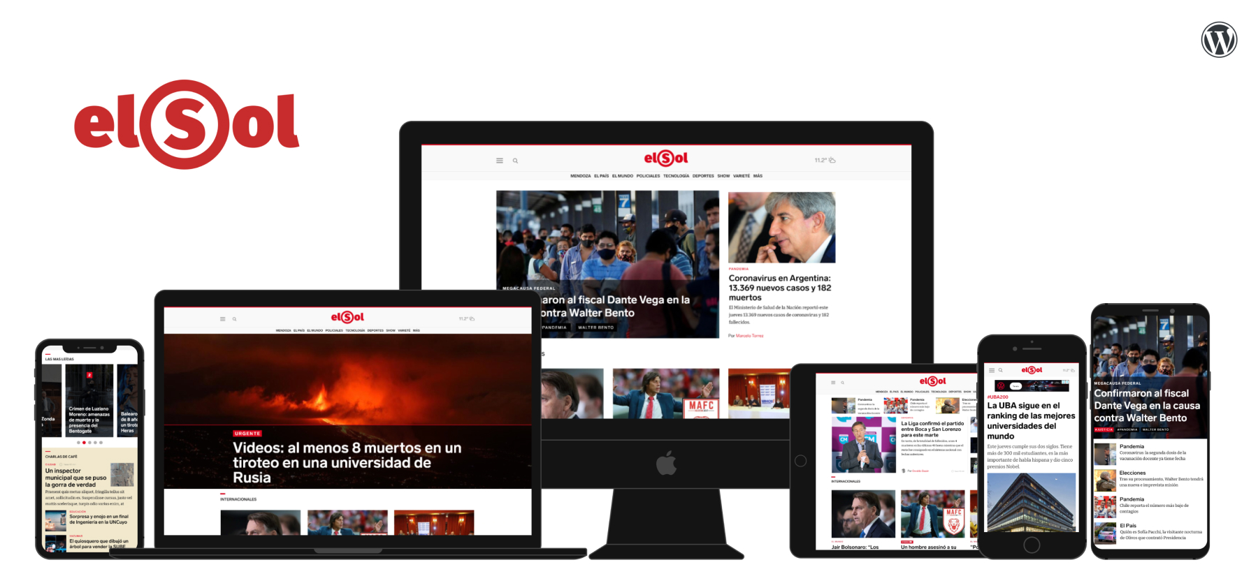
About the project
Diario El Sol Mendoza is a popular newspaper in the region of Cuyo Argentina and is a top 10 news site in Argentina, receiving +3M monthly visitors. The editorial staff is composed by 20 journalists and content creators that create and share around 50 stories a day, including breaking news, investigation, opinion, and entertainment content.
The site redesign was conducted during late 2021 and 2022 and was based on insights from research with local and national newspaper audiences, Google Analytics and Search console metrics, as well as interviews with editorial staff and managers.
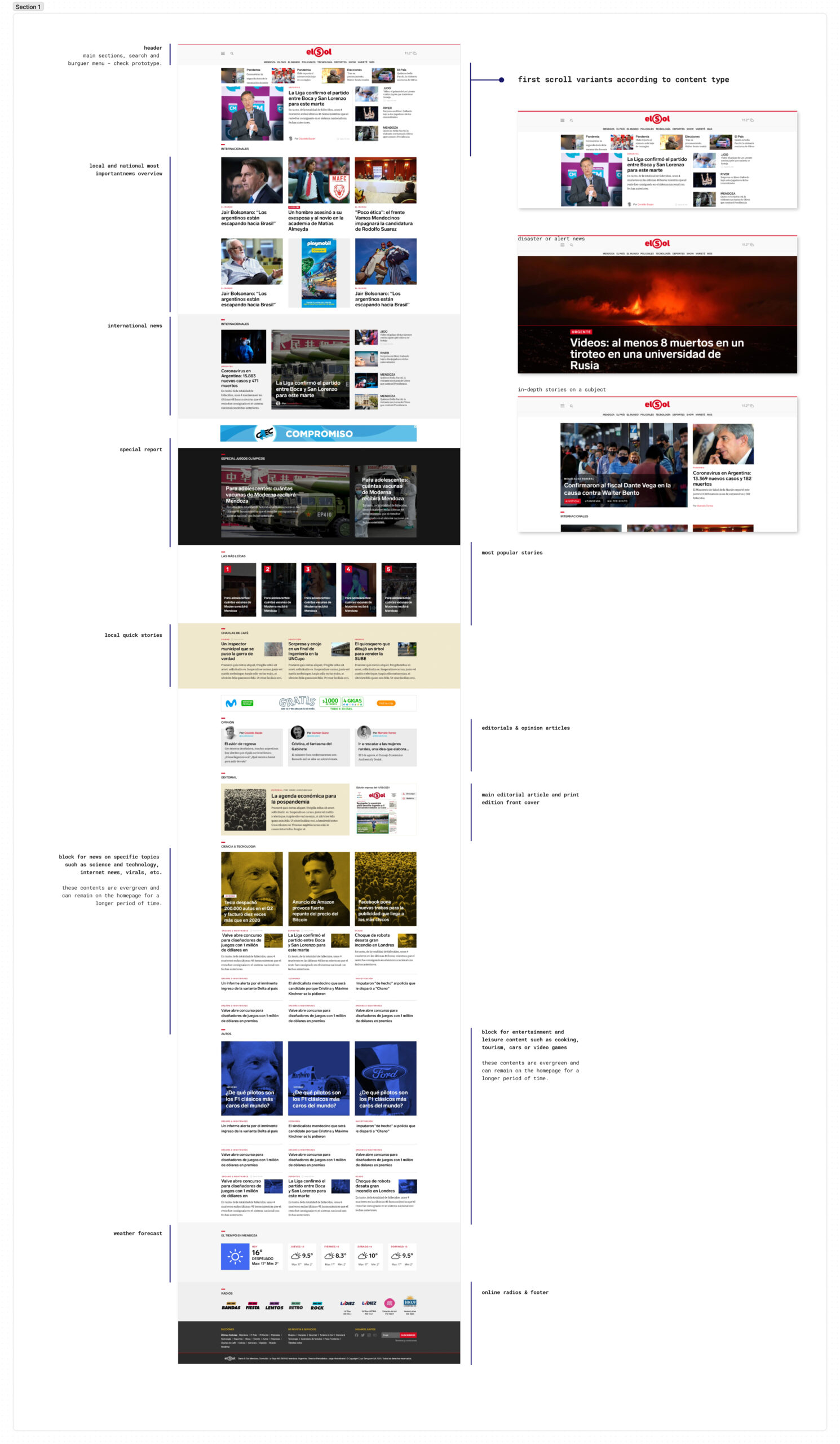
Inside the prototype, please click on each page to see different designs and screens as homepage, mobile version, etc
Some design considerations
Layout
Based on the research, the first scroll is the most important part of the site, being that users scan in a lower percentage. It was decided to design 3 different layout options for this area, according to the most frequent editorial needs. Daily agenda or multiple topics, in-depth story (the topic of the day), and catastrophe or informative alert (for example, earthquakes, which are common in this zone).
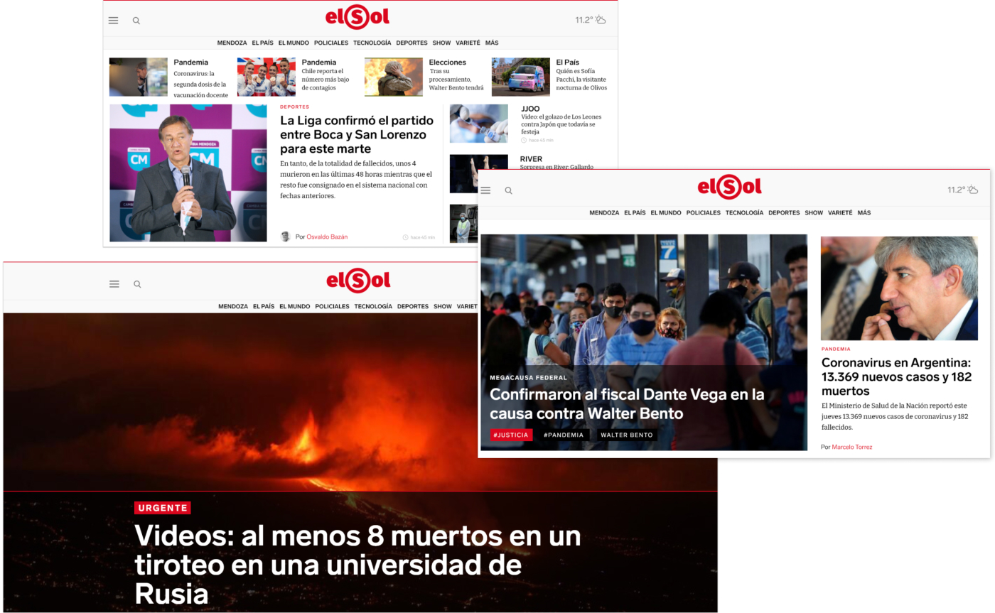
Daily agenda or multiple topics, in-depth story (the topic of the day), and catastrophe or informative alert
Content blocks are designed based on research results and KPI metrics. Adaptable to changing information needs.
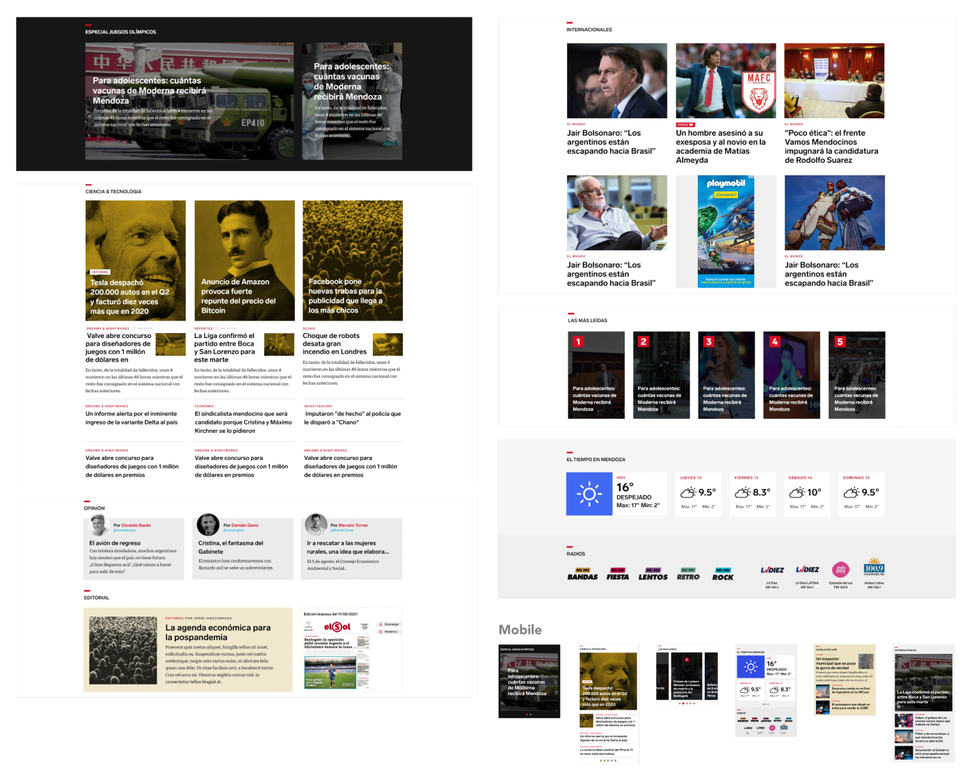
Content blocks are designed based on research results and KPI metrics. Adaptable to changing information needs.
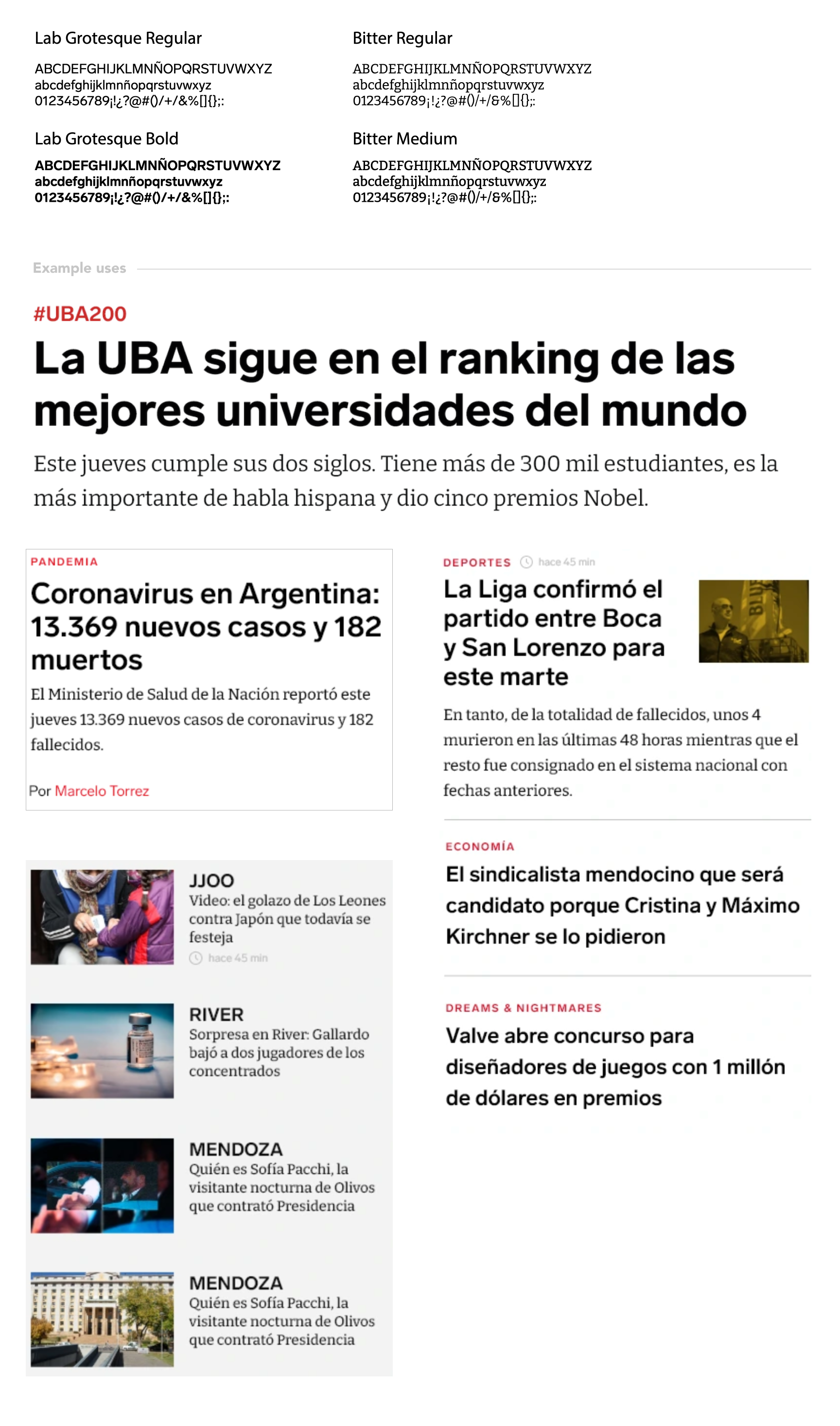
Typography
Premium typography for brand differentiation among competitors, using google fonts or open-access fonts.
Color
Use of branded color palette for core and proprietary content, and color variants for third-party or entertainment content. We proposed the use of a color filter on the images of certain sections to distinguish them from the strict news content.

Navigation and layout
By following the link, you can access a Figjam Board with explanations and details about some of the features of the website’s UI
Some Results
