Tapestry health

Tapestry Health provides telemedicine and remote patient monitoring to nursing homes, hospitals, and assisted living facilities across the U.S. They empower medical teams with tools to improve patient care, reduce errors, and streamline processes.

  • My Role: Lead UX/UI Designer
  • Team: 3–5 frontend developers, 1 manager, 1 business analyst (periodically), 1 UI designer (later stage)
  • Project Duration: Ongoing, with three key phases over 18 months
UX Design
UI Design
Visual Design
UX Research

😦 Problems

  • Fragmented tools and workflows caused inefficiencies, leading to lost productivity, increased costs, and frustration among staff.
  • Manual processes for data entry and communication increased the margin for human error, potentially impacting patient treatment and care.
  • Lack of task management tools resulted in unclear accountability and operational delays, further contributing to financial losses.
  • The platform struggled with scalability and brand 

😊 Solutions

  • Design a unified dashboard to consolidate data and automate tracking, eliminating manual effort, reducing errors, and improving operational efficiency.
  • Build a Queue Assignment feature to streamline task assignment, tracking, and scheduling, enhancing accountability and ensuring timely actions.
  • Develop and Maintain a centralized design system to ensure visual and functional consistency, support seamless scalability, and reduce inefficiencies in the design process.

Optimizing Healthcare Efficiency

As the UX/UI Designer on the Tapestry Health platform project, I collaborated with a small team of front-end developers, a project manager, and occasionally a business analyst. My responsibilities included user research, workflow design, visual design, and creating documentation for the developers. The project unfolded across three distinct phases:


Phase 1: Core Functionality, The “Remote Patient Monitoring Integrator” (8 months)

The project began with a discovery and research phase focusing on the core functionality: patient monitoring and notification management. I worked closely with the team to map user pain points and define key objectives for improving workflows. We conducted user testing after ideation and multiple design iterations to validate solutions and fine-tune the design. This phase concluded with preparing visual design deliverables, including detailed documentation for handoff to development.
 

Phase 2: Queue Assignments (6 months)

Following the success of the core functionality, the client extended our collaboration to include the design of Queue Assignments, enabling users to create, assign, reassign, and schedule work tasks internally. This phase followed a similar process: research, ideation, iterative design, user testing, and final delivery. My role also involved ensuring seamless integration of the new features with the existing system.

Phase 3: Customer Portal (2 months, ongoing)

Currently, we are working on designing a Customer Portal to provide centralized access for hospitals and clinics, extending the platform’s benefits to external users. This phase involves integrating the same principles of workflow optimization and service improvement but tailored to the needs of external stakeholders.§

Designing the RPMI Solution

This case study focuses on the creation of the Remote Patient Monitoring Integrator (RPMI), a foundational system that integrates core functionalities for patient monitoring and notification management. RPMI was the backbone for subsequent feature expansions and continuous improvements, enabling enhanced efficiency and scalability for healthcare operations.

Understanding Users

To design an effective solution for Tapestry Health, understanding the existing workflows and the challenges faced by healthcare professionals was essential. We aimed to uncover inefficiencies and pain points through a structured research process, which laid the foundation for a user-centered design.

The research and ideation process for this project included three primary components:

  1. Business Alignment: Understanding organizational workflows, goals, and pain points from key stakeholders.
  2. User Definition: Identifying user personas and key roles, particularly clinicians and nurses who directly interact with the system.
  3. Technical Exploration: Addressing specific technical requirements related to remote monitoring devices and the integration of PrimeNG components.

Key activities included:

This process allowed us to identify key inefficiencies and pain points that affected healthcare professional’s ability to manage patient care effectively:

Fragmented Information:

Data was spread across multiple outdated systems, including spreadsheets, paper records, and third-party applications, leading to inefficiencies and higher risk of errors.

Inefficient Workflows:

Healthcare professionals had to navigate between several platforms, wasting time and increasing the chances of mistakes.

Lack of Data Visibility:

Existing tools did not provide a comprehensive view of patient data, making prioritizing care and tracking patient progress difficult.

Training Challenges:

The complex systems required significant training, slowing down adoption and workflow efficiency.

Ideating The Solutions:

The research and ideation processes were not a static, waterfall-style effort. It was dynamic, with several iterations and revisions of the initial insights, it evolved based on:

  • Continuous feedback from stakeholders.
  • Results from usability testing.
  • Insights gained from prototype iterations and client discussions.

To document and visualize findings, we created several key deliverables:

Final Designs

We developed a modern, intuitive interface from the ground up, with a strong focus on usability and scalability to meet the needs of healthcare professionals in diverse clinical environments. The design process was centered on simplifying complex workflows and ensuring that critical patient data was both accessible and actionable.

Simplified Workflows

We consolidated data from multiple, fragmented systems into a single, cohesive interface. This integration eliminated the need for healthcare professionals to toggle between different platforms, streamlining tasks and improving efficiency. Key processes, such as patient monitoring, alert management, and data entry, were simplified and optimized for quick access.

Clear Data Visualization

Given the fast-paced nature of healthcare, we prioritized clear and intuitive data visualization. The interface was designed to display critical patient information — including vitals, alerts, and trends — in a format that was easy to read at a glance. Data was organized in a way that highlighted essential metrics, allowing clinicians to quickly assess a patient’s condition without needing to sift through complex reports.

Responsive Layouts

Initially designed for desktop use, the system’s focus was validated through interviews with nurses and doctors. However, discovery sessions revealed the importance of tablet compatibility for on-site staff in clinics and hospitals. A mobile version was discarded after use case testing, with clear communication provided to guide users toward tablet or desktop access for optimal functionality.

Notes on Accessibility

Since the implementation of accessibility heavily relied on the development team and the client, I educated stakeholders and advocated for testing and adopting good accessibility practices.

While some recommendations—like multilingual functionality—were not implemented due to budget constraints, other critical aspects were successfully incorporated. This was possible thanks to the client’s openness and using the PrimeNG framework, based on Google’s Material Design Guidelines, which provides components validated against accessibility standards.

Positive Outcomes

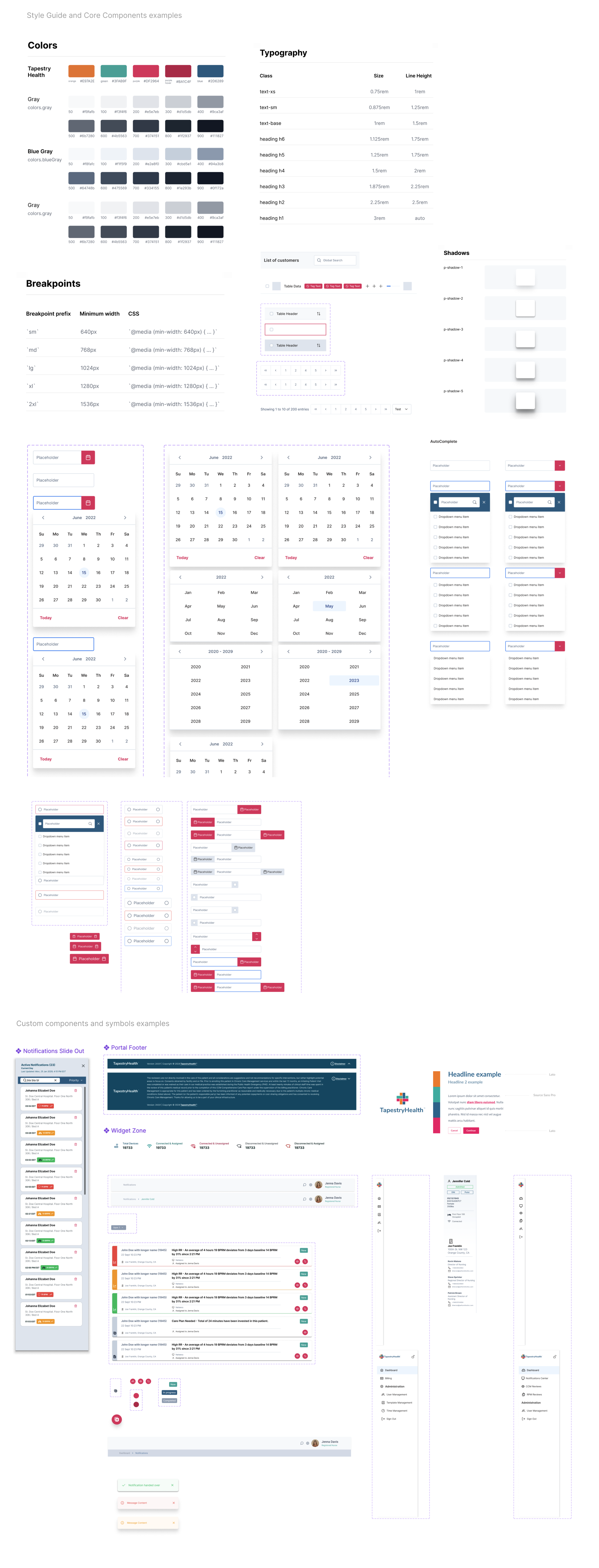
Built-In Accessibility with PrimeNG

The PrimeNG Accessibility Guide was instrumental in ensuring our designs and the frontend implementation complied with WCAG standards: (PrimeNG has WCAG 2.1 AA level compliance).

Its components supported features like proper contrast, keyboard navigation, and clear labeling, reducing the need for custom accessibility solutions.

Educational Efforts and Collaboration

Developers and the client showed openness to receiving and implementing an accessibility testing guide I created, which outlined:

  • Steps to validate keyboard navigation.
  • Correct use of ARIA labels for interactive elements.
  • Examples of good practices, like alt text for images and properly labeled form fields.
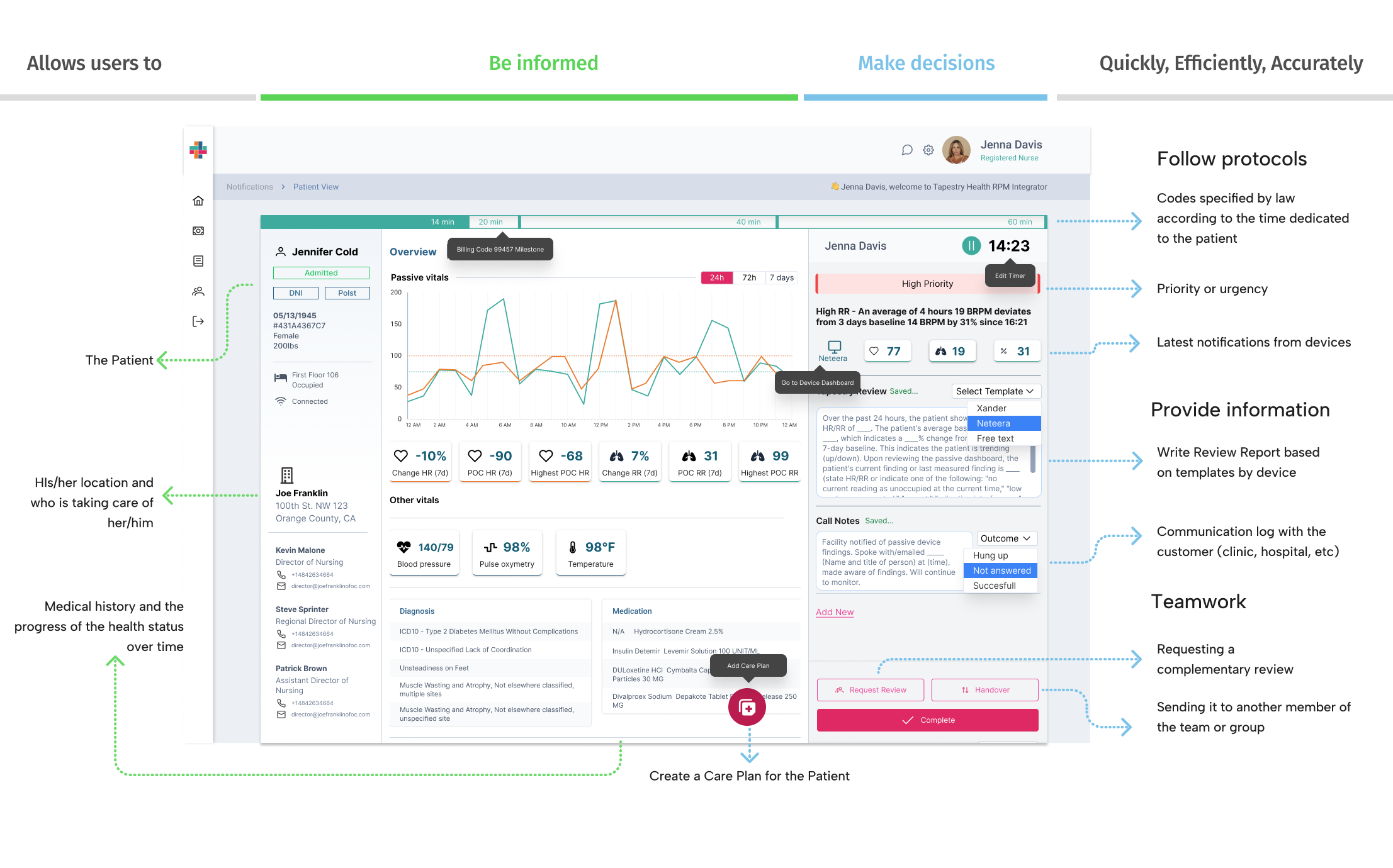
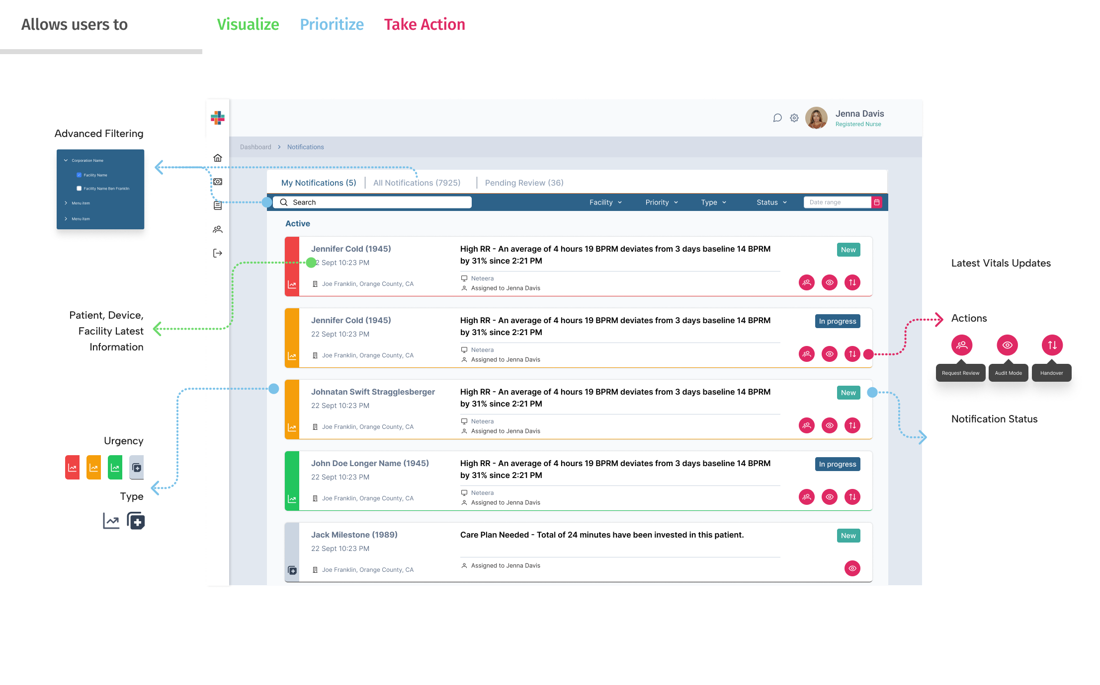
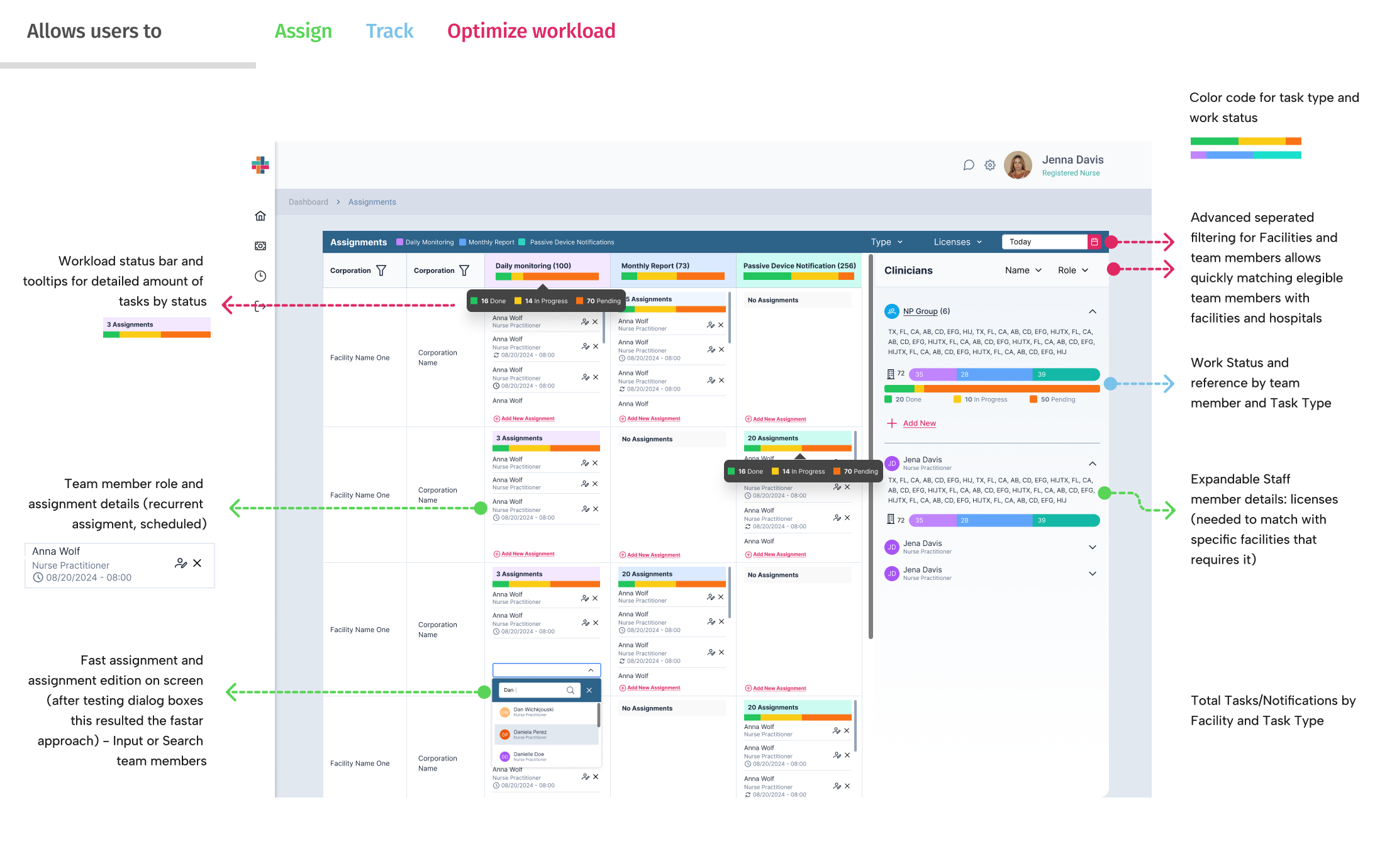
    Responsive Design Insight

Challenges and Lessons Learned

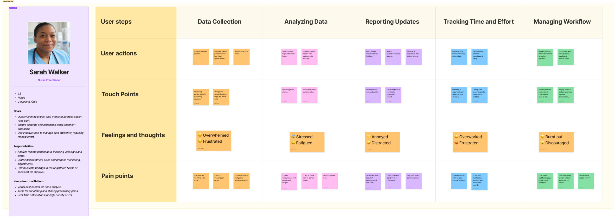
1. The value of the user perspective on accessibility

Discussions with onsite nurses and doctors revealed that they often used tablets during rounds to take notes and work on the go. This insight led to the adaptation of the design for tablets in the third project phase (Customer Portal).

This meant a broader accessibility for healthcare providers working under dynamic conditions. As a secondary Benefit, this design approach improved inclusivity for Tapestry Health’s internal staff, enabling them to use the system while moving around or working remotely.

2. Missed Opportunity: Multilingual Support

This feature I proposed could have benefited facilities in communities with a significant Spanish-speaking population but was postponed due to budget constraints. Despite not having been implemented, this was well appreciated by the client, who recognized the professionalism in the design and thanked the information, being this escalated even to the management areas of the business for a future update.

3. Sharing best practices and guidance for testing  in developers’ handoff stage

I learned to have the flexibility to accept that direct control over some elements, such as the final check of designs in production, would be left to other staff members as QAs and developers, while at the same time taking into account the professional responsibility of emphasizing and convincing about the benefits of accessibility in design.

The team accepted and implemented a comprehensive accessibility testing guide I provided, ensuring these practices were fully applied in development.

Design System Overview

The design system for this project established a documented grid and margin system tailored for developers. It leveraged the foundations of PrimeNG, the client-requested framework, and customized its components based on a cohesive style guide. This included typography, color palette, elevation, and transitions aligned with the brand’s identity. Components were categorized into two groups: customized PrimeNG elements and unique components designed specifically for the app.

This structure enabled rapid onboarding of new designers without compromising visual consistency and supported the seamless application scaling to two sub-products: the Customer Portal and Tapestry Complete. Both expansions maintained cohesive navigation, branding, and user experience.


Key Screens

Throughout the project, we designed over 100 screens and crafted 10 detailed user flows to ensure a seamless and efficient experience. Due to space constraints, this case study highlights some of the most critical screens and workflows that demonstrate the core functionality and value delivered to the users.

Patient View

Notifications Dashboard

Assignments

Outcomes and Key Takeaways

The results of the team work and strong communication with the client, were solid design approaches that significantly improved the user experience for clinicians and technical staff, offering:

  • 40% reduction in time spent managing patient data.
  • 25% increase in billing by optimizing code/time/work visibility
    Increased accuracy and reduced errors in monitoring workflows.
  • A scalable system ready to support Tapestry Health’s growth and backend capabilities
    +200 screens, +50 custom components aligned to PRIMENG
  • Tapestry Health is now better equipped to deliver its mission of improving patient outcomes through advanced remote monitoring solutions.

The development of the Remote Patient Monitoring Integrator (RPMI) for Tapestry Health successfully streamlined healthcare workflows by consolidating fragmented data into a unified interface. This improved efficiency and decision-making for healthcare professionals, enhancing patient care.

One key takeaway from this project was the value of collaboration and adaptation. Working closely with healthcare professionals gave me a deeper understanding of the crucial role technology plays in their daily work, particularly in high-pressure situations. Their dedication inspired us to refine every aspect of the platform.

A job well done, built on active listening and offering thoughtful solutions, fosters trust and long-term client relationships. By addressing unspoken needs and suggesting improvements beyond the original scope, we not only added value but also strengthened our partnership for the future.