Community and information as a key to learning and training products
In this case study I’ll be sharing my experience as a UX/UI designer on the Valhallan esports training platform. Throughout this project, I had the opportunity to address key user challenges and enhance the overall user experience of the platform.
In this case study, I intend to share an overview of the research process, proposed solutions, and the outcomes achieved by implementing user-centric design principles, all with the ultimate goal of providing a seamless and enriching experience on the Valhallan esports training platform.
Note: This project was linked to a more comprehensive project, which included different products interrelated by common technical and operational characteristics. A brief analysis of how we developers worked together to achieve better results in a demanding timeframe, and how we approached these challenges from a design perspective, can be seen in this case study.
Problems
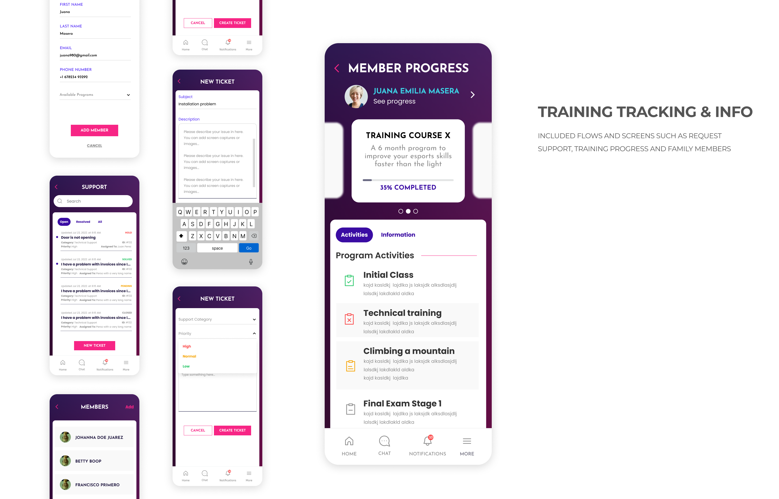
Lack of progress tracking and communication features. Frustration with slow query response and support system.
- Users are unable to monitor their progress, achievements, or pending tasks, leading to frustration.
- Difficulty in obtaining detailed information, which resulted in the consideration of abandoning the program
Solutions
To create a user-friendly app for the Valhallan esports training platform that enables students to track their progress, communicate with the community, and access support easily.
- Develop an app with features for progress tracking, task management, and evaluation results display.
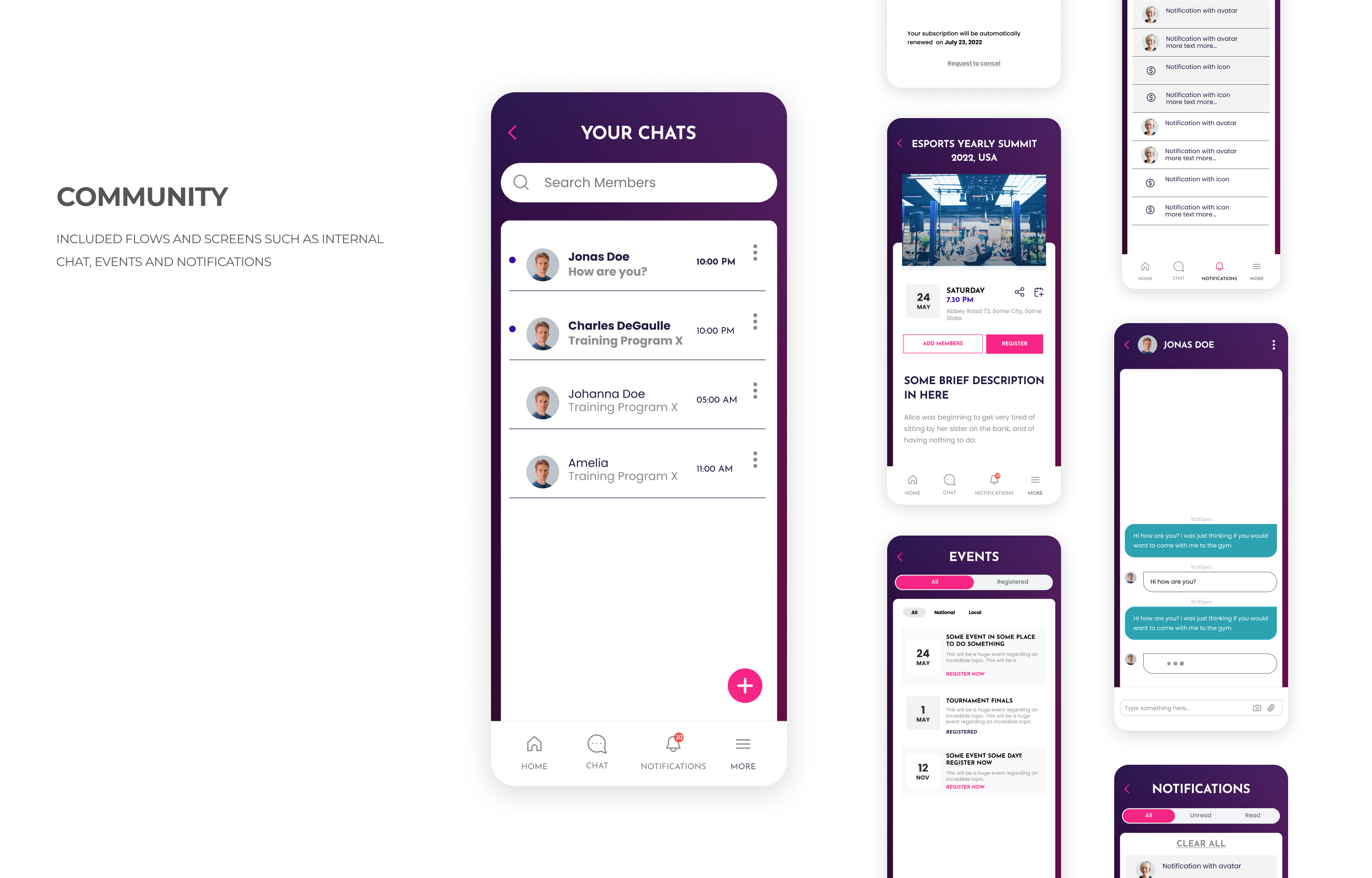
- Implement chat and events functionalities to promote community interaction.
- Improve the support system to ensure quick response and easy access to information.
- Sketching
- Storyboarding
- Lo-fi and interactive prototyping
- Explanatory video presentations
- Brainstorming and Ideation sessions
- Validation of hypotheses
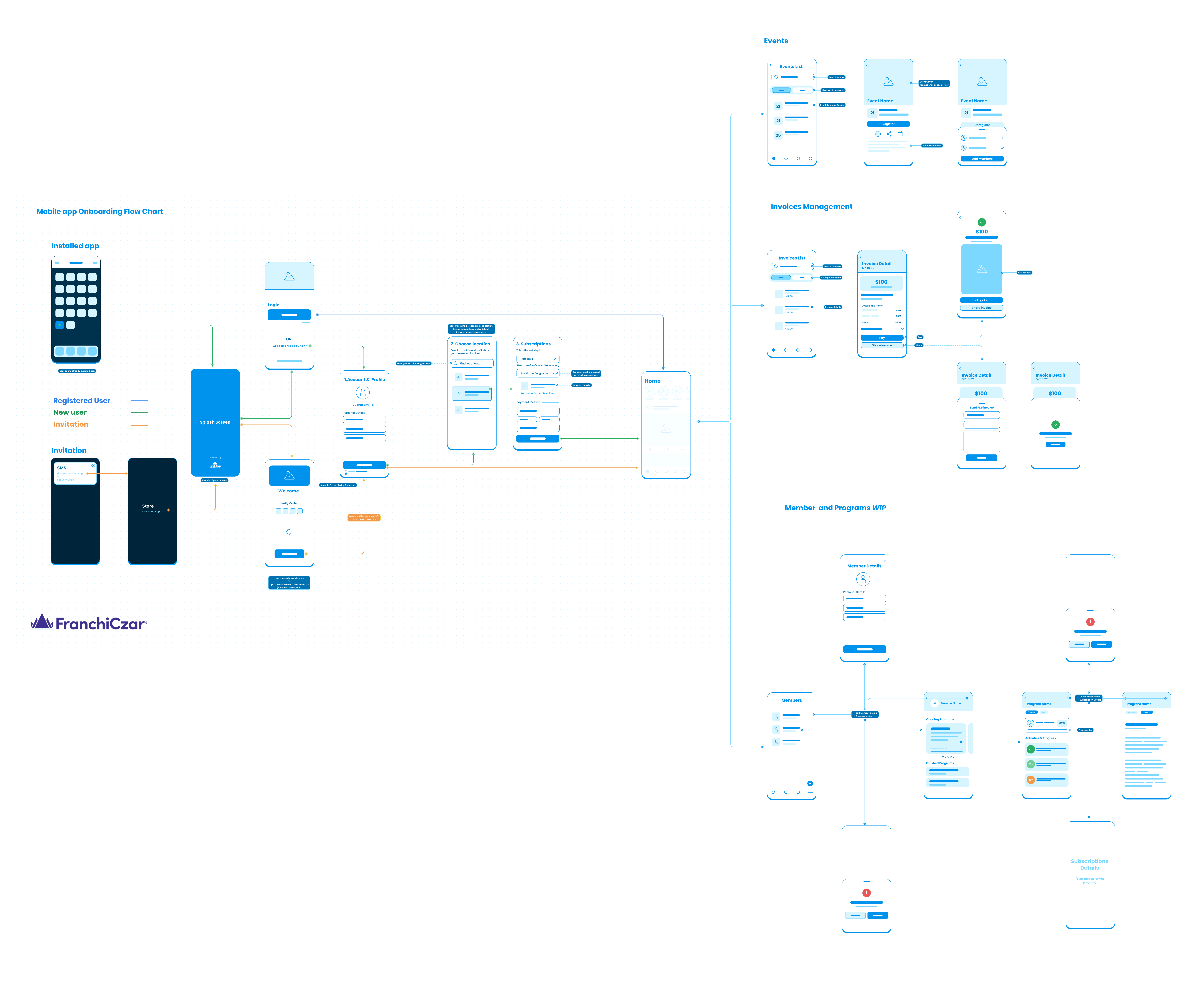


Main Features

Research
Our research phase encompassed both quantitative and qualitative methods, including 100 surveys and 10 in-depth interviews. Through the surveys, we gained a broad understanding of user preferences, while the interviews provided valuable insights into the experiences and expectations of current Valhallan students and subscribers.
At the beginning, as well as throughout the entire process, discovery and iteration meetings were held, from which aspects of feasibility, profitability, and scope of the project emerged. The teams present at the meetings were composed of directors, managers, marketing teams, project managers, and developers.
This comprehensive research approach enabled us to uncover key pain points and opportunities for improvement, informing the design process and shaping the proposed solutions for an enhanced Valhallan esports training platform.
- Stakeholder interviews to gather insights about business goals.
- Individual in-depth interviews (IDI): Interviews with enrolled students, managers, teachers, and Valhallan's subscribers
- Online surveys targeting a database of potential customers.
- Among potential users, there is a strong interest in esports training platforms like Valhallan.
- Potential users emphasized the importance of easily accessible and comprehensive course materials, with 89% highlighting the need for well-structured and organized content.
- The majority of respondents (83%) expressed a preference for a mobile app that allows for convenient access to courses, support, and progress tracking.
- Personalized feedback and guidance were cited as essential features by 71% of potential users, indicating the desire for community features within an app.
- 62% of surveyed individuals mentioned the importance of a clear and transparent registration process, including easy access to information about available courses and pricing options.
-
Users expressed dissatisfaction with the current support and tracking features of the Valhallan platform. They desired more efficient and instant solutions to access support and track their training progress, emphasizing the importance of timely feedback and assistance.
-
Lack of real-time communication and interaction with teachers and fellow students was a common pain point. Users highlighted the need for seamless connectivity, collaboration, and engagement within the platform, emphasizing the value of prompt responses and meaningful interactions.
-
Users, including parents, found the registration and management processes frustrating and time-consuming. They expressed a desire for a more user-friendly and intuitive interface to manage subscriptions, track progress, and access course information, seeking simplified and streamlined processes.
Our Users
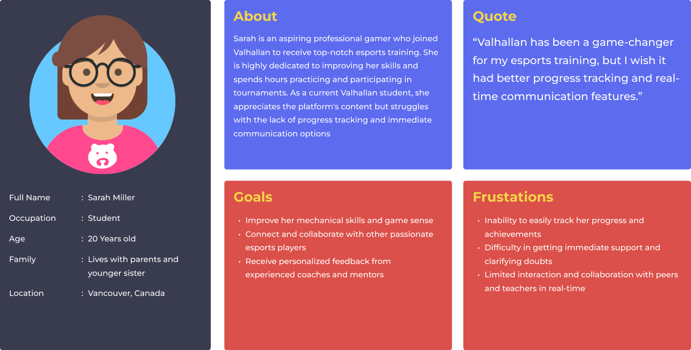
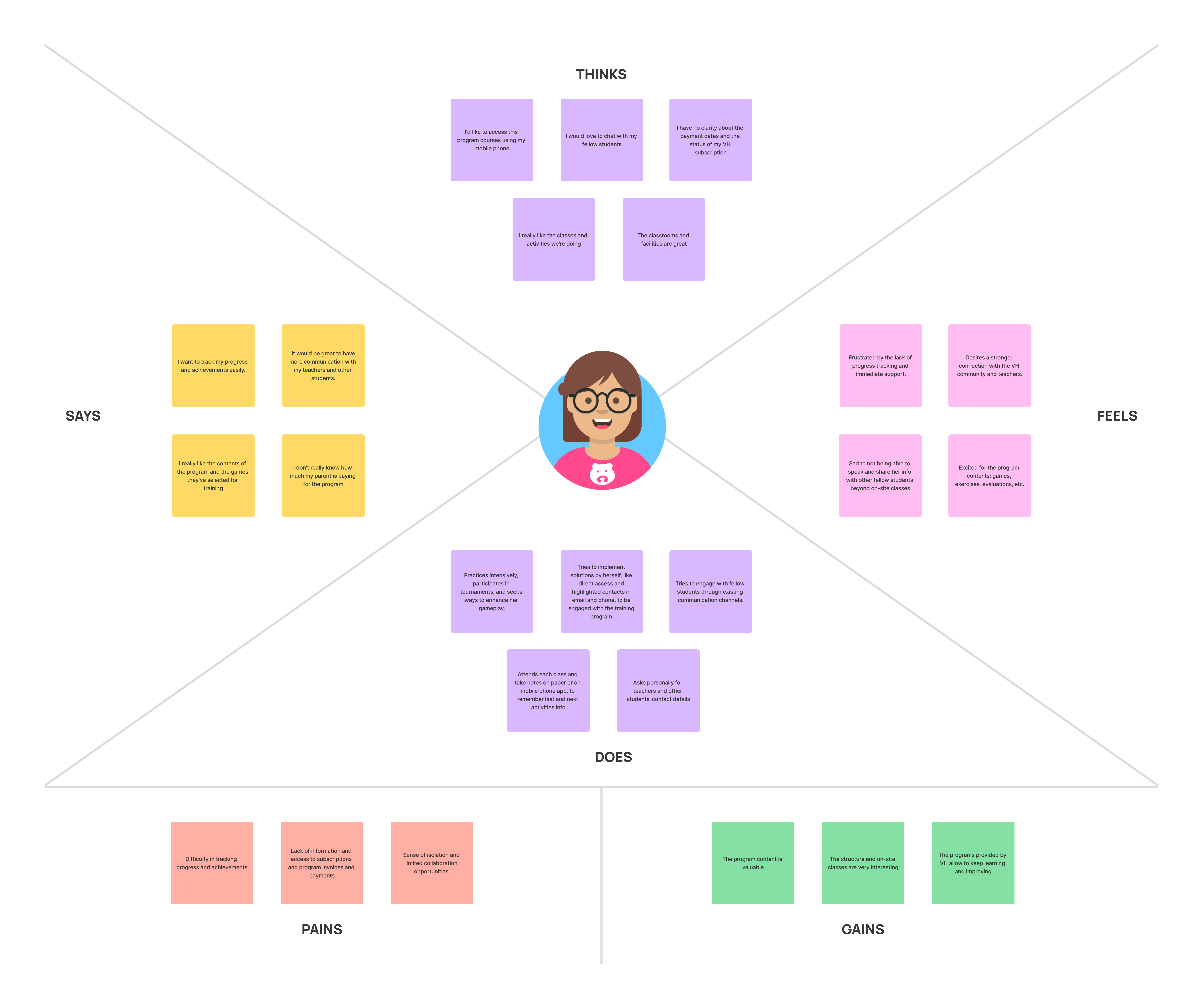
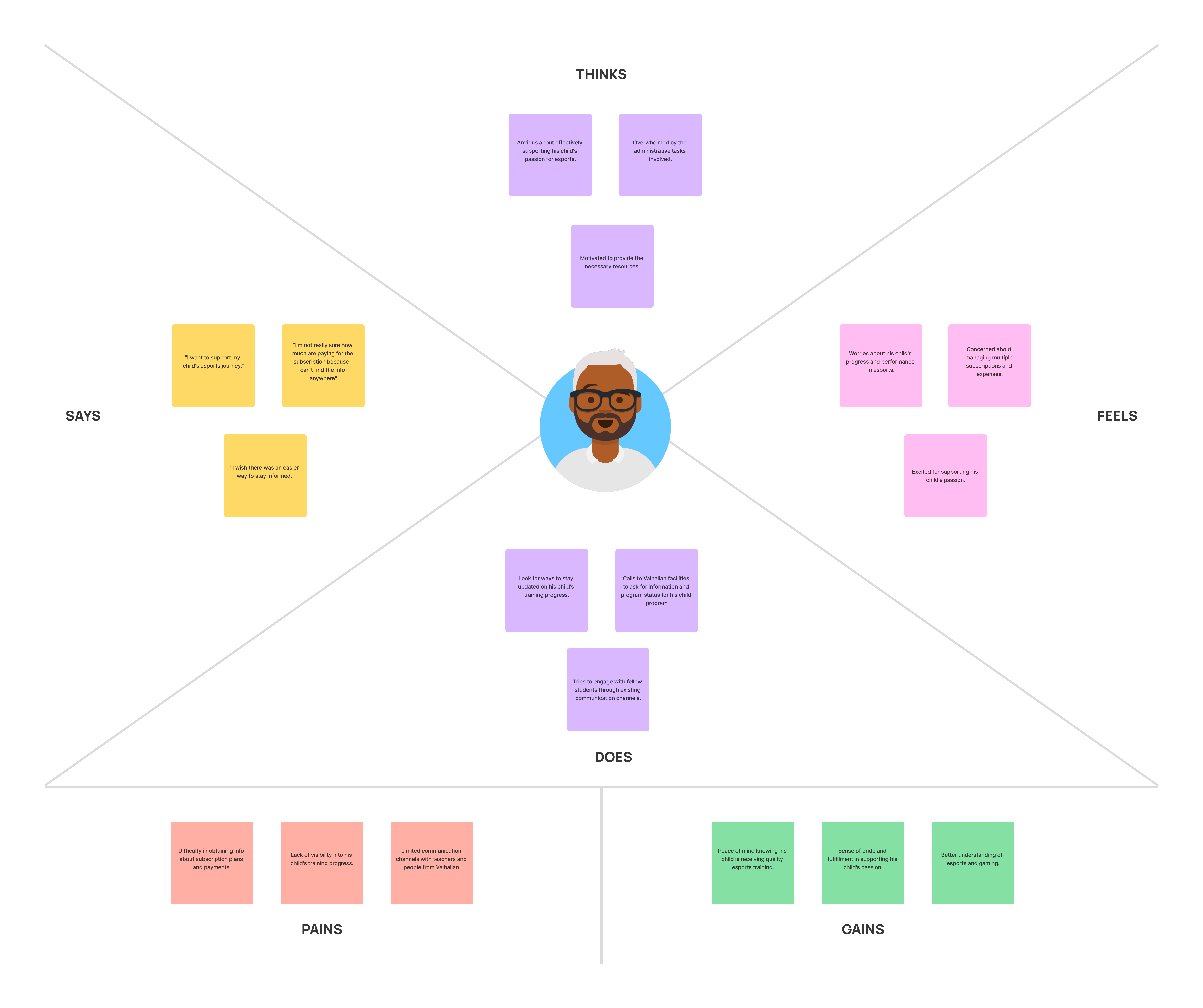
Through user personas, user journey maps, and empathy maps, we gained valuable insights into the needs, frustrations, and aspirations of Valhallan users. This empathetic approach helped us understand their experiences with the platform and identify areas for improvement. By putting ourselves in their shoes, we were able to shape our design solutions to better meet their expectations and create a more engaging user experience.
Imagining the VH app
With a clear understanding of the problems based on the research insights and analysis, we facilitated brainstorming sessions where team members shared their ideas, thoughts, and suggestions. During this process, I provided stakeholders and meeting attendees with sketches and low-fidelity prototypes.
We also discussed the user flow for the main features and analyzed the technical possibilities for each different case. We spent a month iterating this ideation process within the team and validating them with current students, teachers, and the director of the VH facilities.
We encouraged an open and inclusive environment, allowing for a diverse range of perspectives and innovative concepts to emerge.
For more information about design and strategic decisions on the design system, you can refer to this case study

Iterations
We published alpha and beta versions of the application for small groups with which we conducted usability tests and QA processes that yielded valuable insights that exceed the length of this case study, but of which I want to mention the detection of possible improvements in readability and layout on various devices when users manually increased the font size in the mobile operating system.
For this, we worked with developers to implement the native functionality of the app for text size adjustment, adapted the design systems in sets of libraries normal, M and L size and prototyped and designed the option in different screens of the app, which also allows customizing other aspects of the overall experience in the app.
Learnings & Next Steps
Impacts
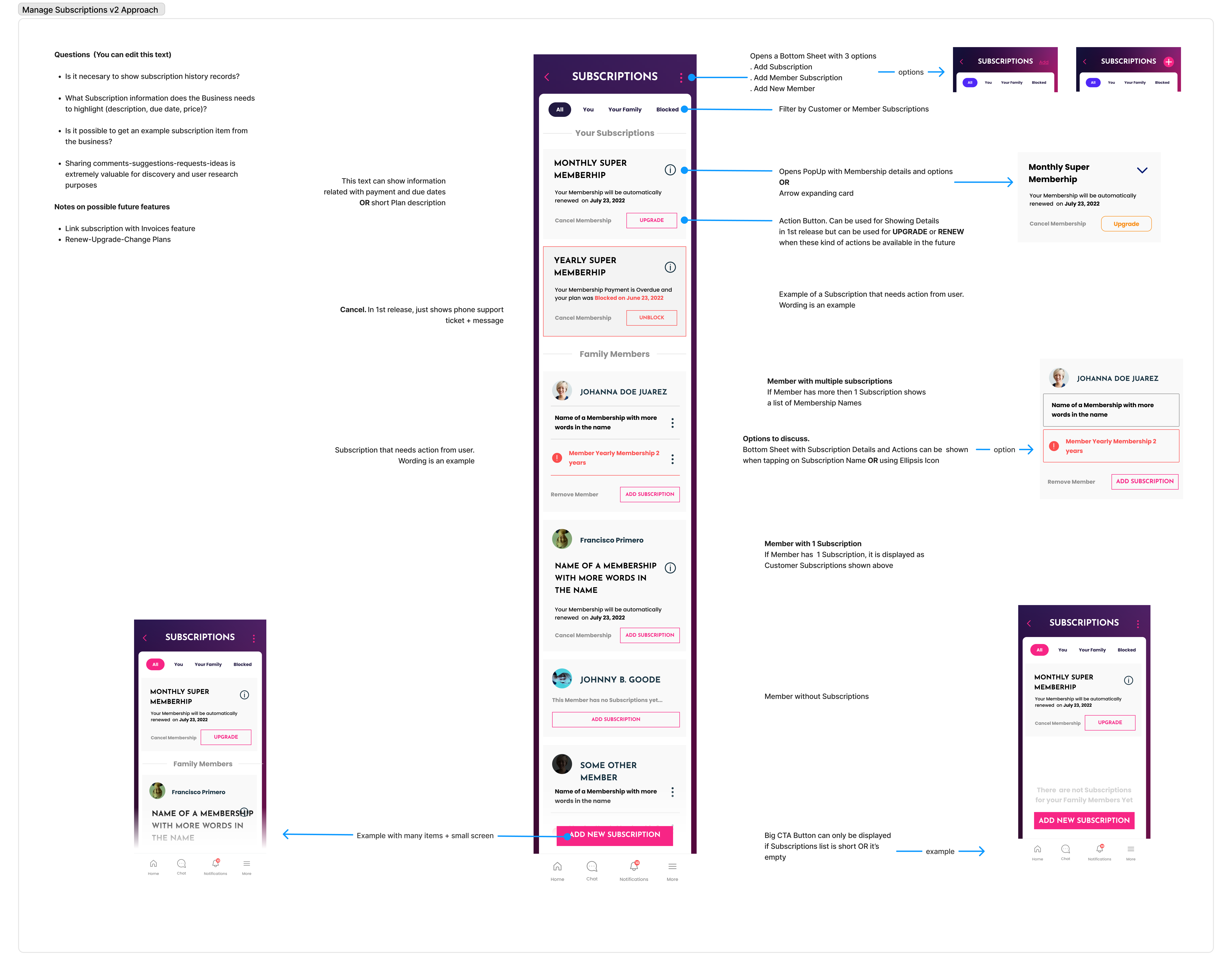
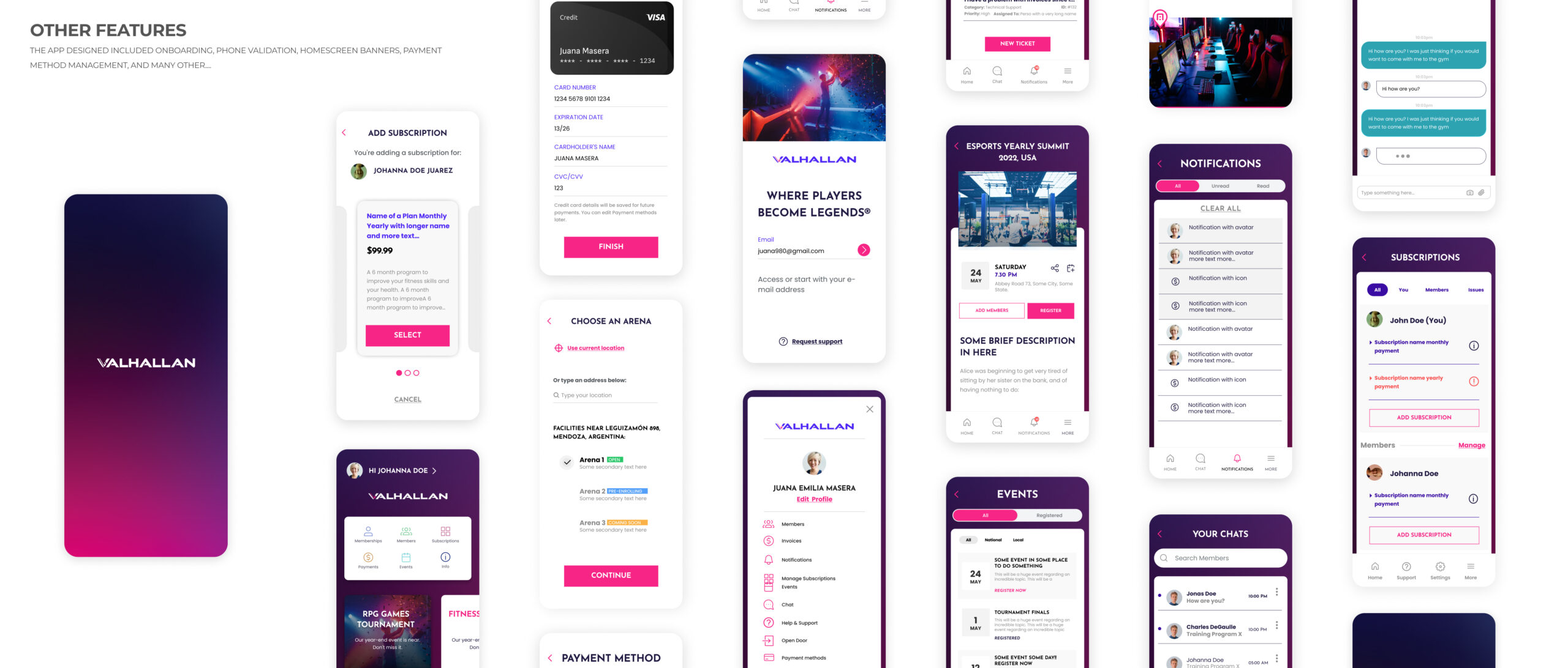
By the time I finished my participation in the project, the functionalities fully implemented were those related to subscriptions and member management, as well as support and a basic initial version of the chat and student progress tracking. Added to this are the general functionalities for the operation of the business, such as onboarding, personal information, payment, etc.
At the beginning of 2023, the development teams were developing the APIs and infrastructure adjustments needed to implement the event features, promo codes, and the more advanced versions of progress tracking, chat and advanced member management. This work is being made possible thanks to the foresight in the design process and the implementation of a robust design system and documentation.
The app began to be offered privately to existing students and communicated on Valhallan’s social networks.
Learnings
Throughout this project, I’ve gained valuable learnings that have had a significant impact on my work as a designer and my understanding of the ed-tech industry. One key lesson I’ve learned is the importance of establishing a solid design system early on, especially when we have limited time and resources. This allows us to stay organized, maintain consistency, and ensure that our product and brand integrity are preserved.
Additionally, this project highlighted the significance of considering scalability and future growth. As the Valhallan esports training platform expands its user base, it’s essential to anticipate and plan for scalability challenges. This involves designing a robust and flexible infrastructure that can accommodate increasing user demands and future feature enhancements. By proactively addressing scalability considerations, we can ensure a seamless user experience and avoid technical limitations as the platform grows.
In summary, this project has provided me with valuable insights to shape my work as a designer but also led me to adapt my strategies in order to create impactful and user-centric solutions, in this case, oriented to meet the evolving needs of the education and technology landscape.
